What you can do with pivot boards
A pivot board is a powerful tool that can display all kinds of summary information on your items and resources. For example, you can learn how much effort are you spending monthly per target market, or what is the most overloaded team in December.
Here are a few examples of what you can do with pivot boards:
How to set up a pivot board
Selecting the right data
Be aware that while pivot boards can display a lot of information, they can be quite slow if you try to display everything at the same time.
To help you to reduce the data volume and make your board as fast as possible, there are a few settings that you can use to select just the data you need. To access these settings, click Settings.
-
Group by (time).
This setting allows you to define the granularity of the time axis. The less granular your board is, the less data will be processed and the faster it will work.
If you do not need the time component at all, use Year as the most coarse granularity. -
Show capacity information.
By default, pivot boards will show resource demand and provision, but not resource capacity. If you want to build a board, which will compare demand vs. capacity, set this checkbox, otherwise unset it. -
Show allocation information.
If you want to analyze financial allocation of your items, set this checkbox, otherwise unset it.
Totals
You can choose to show or hide totals with the Show totals checkbox.
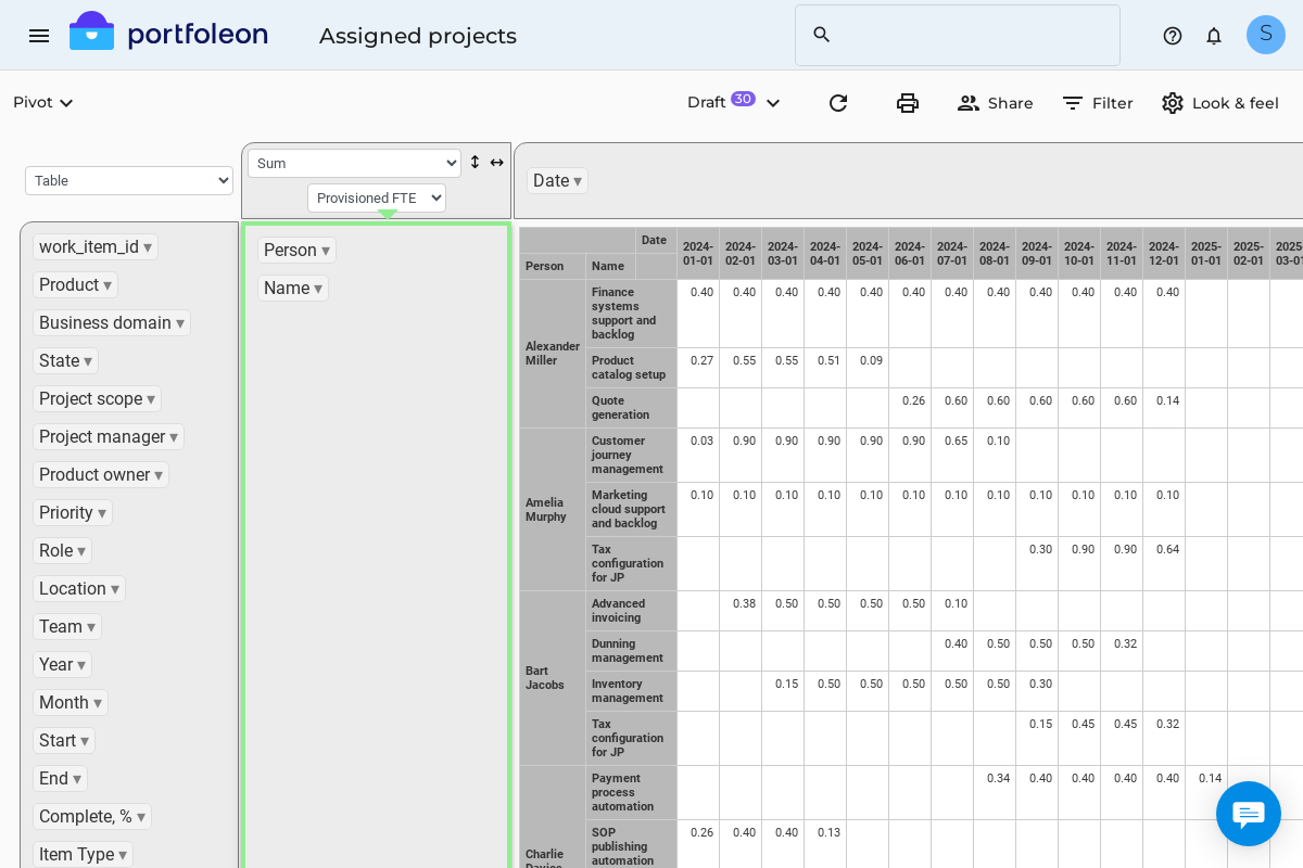
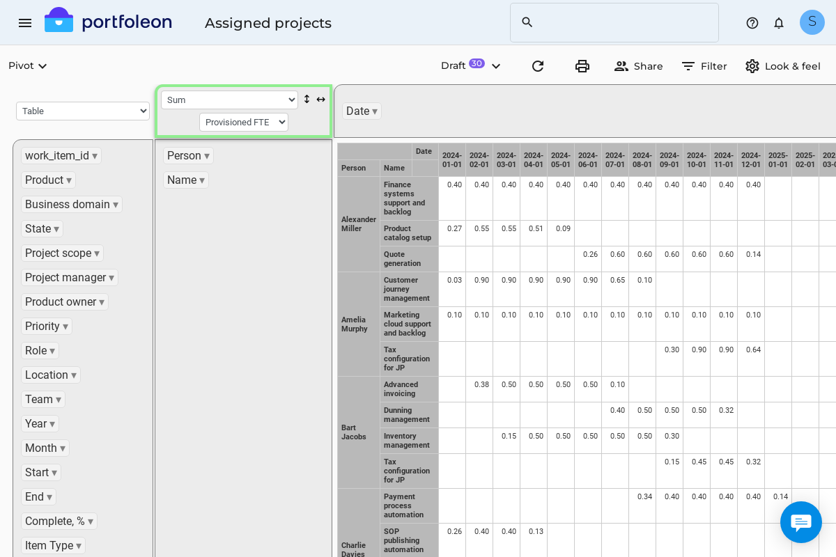
Group by a field
To group by a field, drag it either above the pivot table (to make columns) or on the left of the pivot table (to make rows).
Summarize by a field
To make a summary, select a field in the summary box.
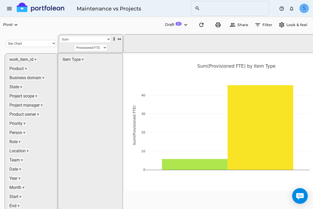
Make a chart
To make a chart, select the chart type in the visualization type dropdown.
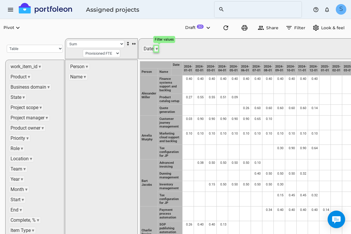
Filter data
To filter data, please click the arrow near the field you wish to filter on, like this: